15 Pink Eye Makeup Vs Red Eye Makeup: Which Is Better?
Pink shadow feels soft and friendly. Red shadow feels bold and a little daring. Both live in the same warm family, yet they change a face in very different ways, and picking the wrong one can leave you looking washed out or far more dramatic than you planned. This guide settles the pink eye makeup vs red eye makeup question one point at a time, across fifteen real decisions: a plain workday, a wedding, a party, a photo, a first attempt with a new palette. Every entry is anchored by a real photo, so you can see how the colour truly sits on skin, on lashes, and around the eye. Some points go clearly to pink, some clearly to red, and a few honestly depend on your skin tone, your eye colour, and how much blending time you have. By the end, you will know which side earns a place in your daily bag and which one to save for the days that call for more.
1. Pink Wash vs Red Wash For Everyday Softness
The photo shows pink at its gentlest: a pale shimmery wash over the lid, a deeper rose pressed into the crease, one thin line of liner, and a matte rose lip that stays close to her natural colour. Nothing shouts. The whole face looks rested, which is exactly what an everyday colour should do.
A red wash can work at this level too, but it has to be sheered right down to a rust or terracotta tint, and even then it reads as a choice rather than a default. Pink melts into the blush and lip colour you already own, so the face stays balanced with almost no planning.
Verdict for slow mornings and daily wear: pink, by a clear margin.
2. Hot Pink vs True Red For A Bold Statement
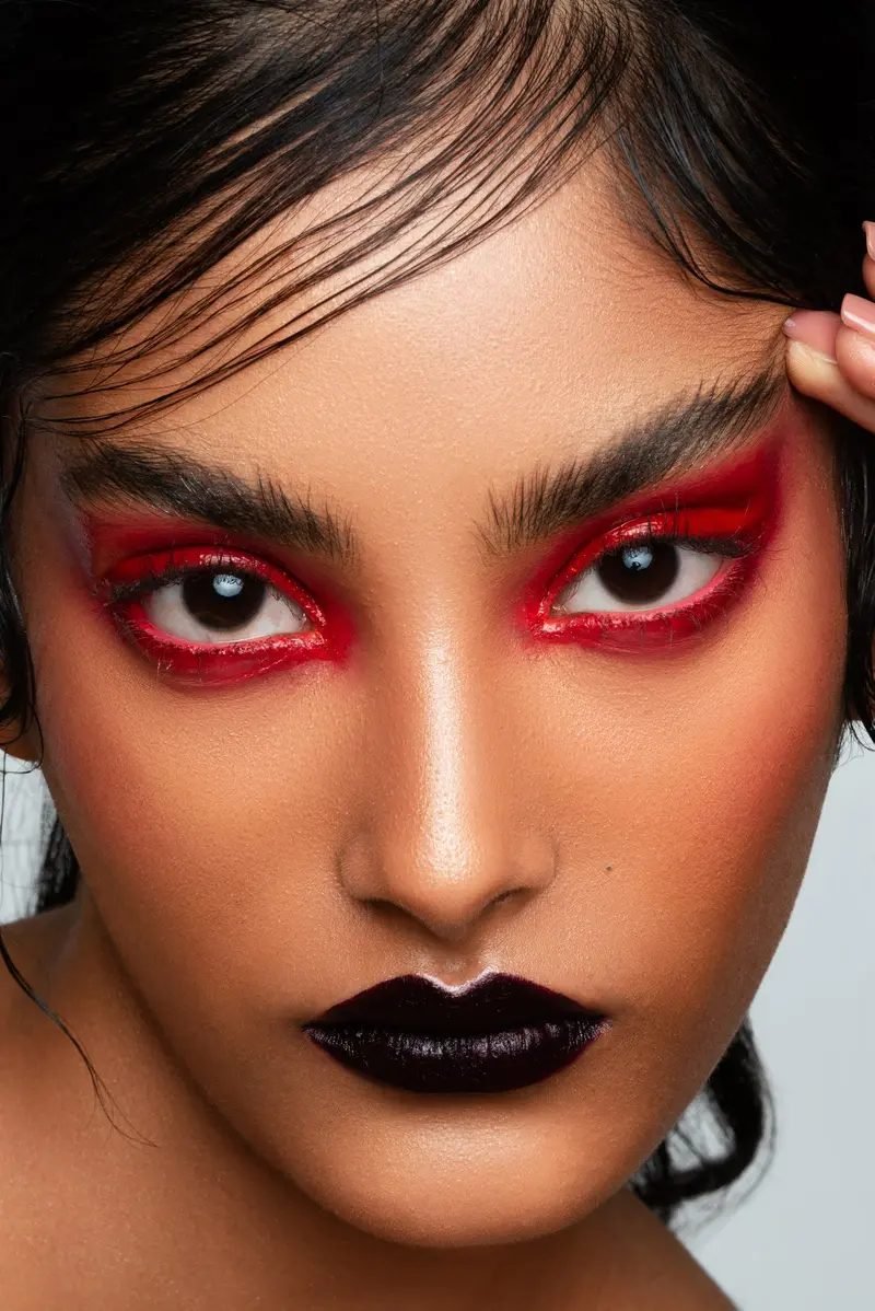
Red does not ease in. In the photo, a true scarlet shadow rings the whole eye, top and bottom, with a glossy red line under the lashes and a deep burgundy lip below. It is deliberate, editorial, and impossible to miss across a room.
Hot pink makes a statement too, and it feels younger and more playful while doing it. Pink shouts in a friendly voice. Red shouts in a serious one, and it holds its own against black clothing, strong brows, and evening light where pink can fade into sweetness. Nothing about a look like this is accidental, and that is exactly the point of it.
Verdict: for pure impact, red wins. For a bold look that still feels fun, take the hot pink.
💡 Quick Tip
A statement eye needs a quiet base. Keep blush low, brows neat, and skin clean, so the colour reads as a decision rather than a pile up.
3. Romantic Pink vs Classic Red For Weddings
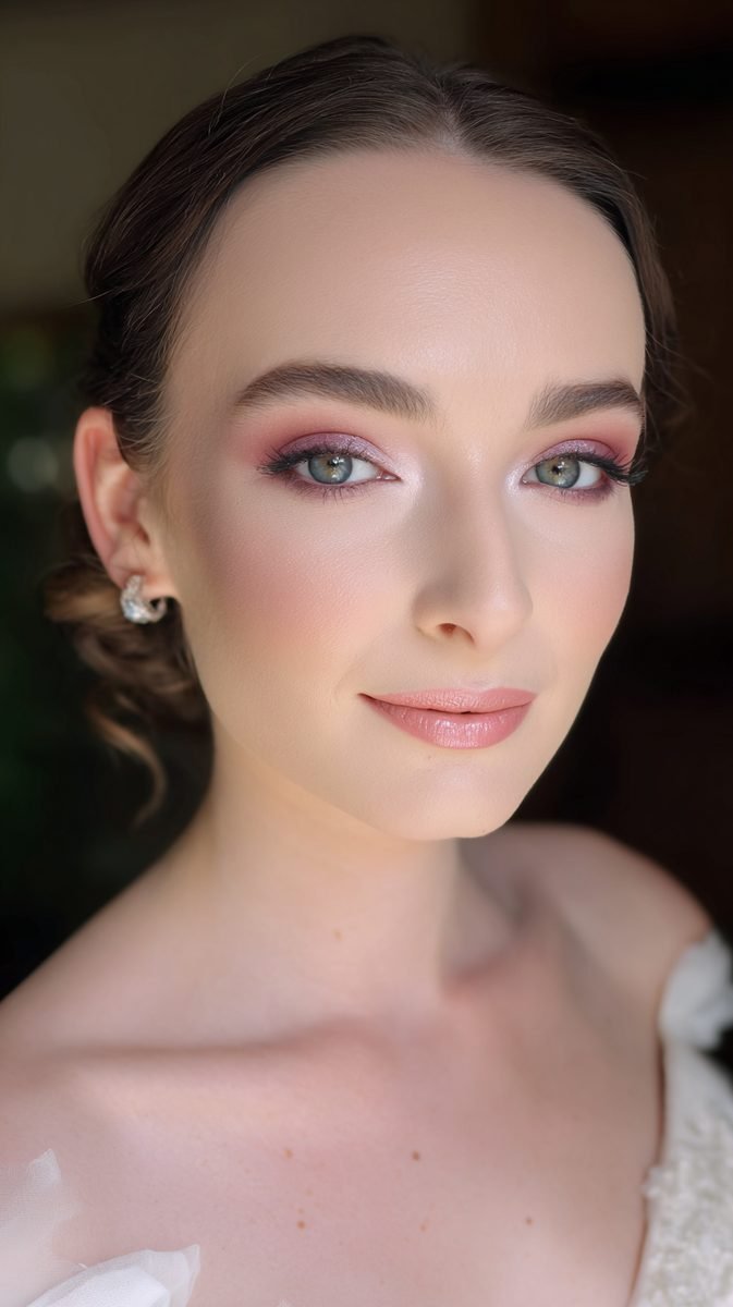
The bride in the photo wears pink the way weddings like it: mauve and rose shadow blended soft at the edges, a bright inner corner, gentle blush, and a satin pink lip that will still look kind after hours of photos and happy tears.
Classic red at a wedding is striking, and plenty of brides carry it well, but it asks for confidence and a steady touch up plan. Red also fights with blush and flowers for attention. Pink sits inside the day instead of standing in front of it.
- Pink: soft in daylight, kind in photos, easy to refresh
- Red: dramatic, formal, needs regular touch ups
Verdict: for weddings and long events, romantic pink takes it.
4. Pink Pop vs Red Pop On Dark Skin
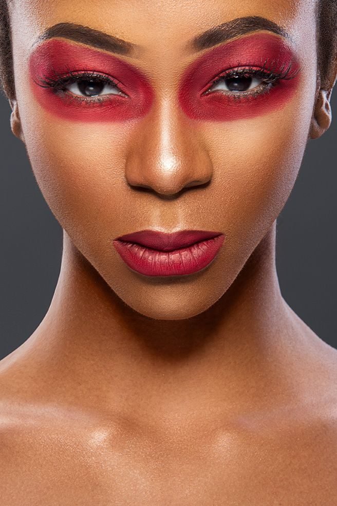
On deep skin, red does something pink struggles to match. The photo shows a rich red shadow swept wide around both eyes with a matching matte red lip, and the colour stays strong and clear against her skin instead of turning pale or grey. That strength is why red keeps showing up in editorial shoots on deep skin tones.
Pink can pop on dark skin too, but it needs saturation: hot pink, magenta, and fuchsia hold their colour, while pale pink washes can vanish or look ashy. Red brings its own depth, so even a simple red wash reads rich.
Verdict: on dark skin, red delivers the bigger impact with less product. Pink needs its brightest shades to keep up.
| Pink on dark skin | Red on dark skin |
|---|---|
| Needs hot, saturated shades to show | Reads rich even in a simple wash |
| Pale washes can turn ashy | Keeps its depth in any light |
| Best shades: magenta, fuchsia, hot pink | Best shades: true red, wine, burgundy |
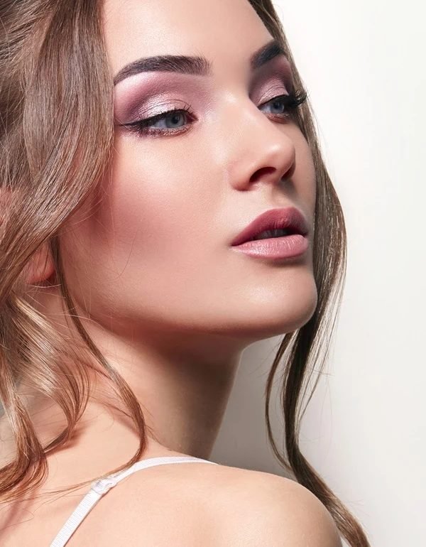
5. Pale Pink vs Soft Red On Fair Skin
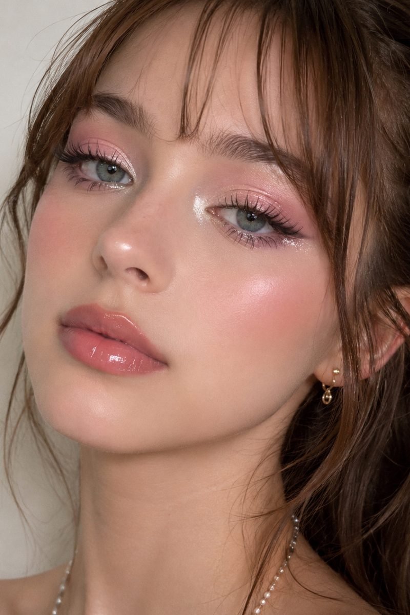
Pale pink was made for fair skin. In the photo, a sheer shimmery pink sits on the lids, blush rides high on the cheeks, and a glossy pink lip finishes a face that looks fresh rather than made up. The colour is close to the skin’s own flush, so it blends in like it belongs there.
Soft red is the riskier guest on pale skin. Worn sheer, a rust or rosewood tint can look warm and pretty. Worn at full strength, red pulls every bit of redness out of fair skin and can make eyes look tired or sore.
Verdict: fair skin wears pale pink with zero effort. Red needs a sheer hand and a muted shade.
Pale pink echoes the natural flush of fair skin, so it brightens the face without ever looking like it is trying.
6. Pink Glitter vs Red Glitter For Parties
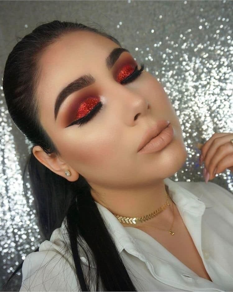
Party light loves glitter, and the photo shows red glitter doing the heavy lifting: packed over the whole lid, sharpened with a black wing, and paired with a plain nude lip so the eyes own the night.
Pink glitter is just as sparkly, and it reads sweeter and more playful, with rose gold and baby pink glitter suiting softer dresses and daylight parties. Red glitter feels grown up and dramatic, and it catches warm evening light in a way pink cannot copy.
One shared warning: glitter travels. Press it over a sticky base and do the eyes before foundation, whichever colour you pick.
Verdict: red glitter for night drama, pink glitter for a lighter party mood.
Recreate this look
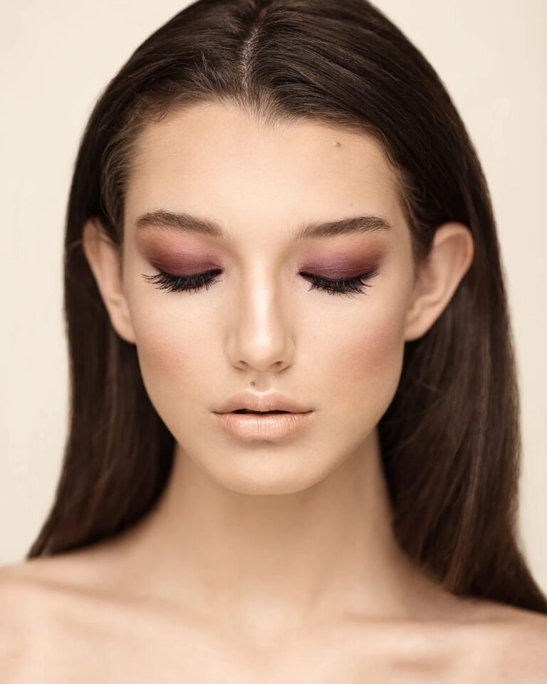
7. Berry Pink Smokey vs Burgundy Red Smokey For Depth
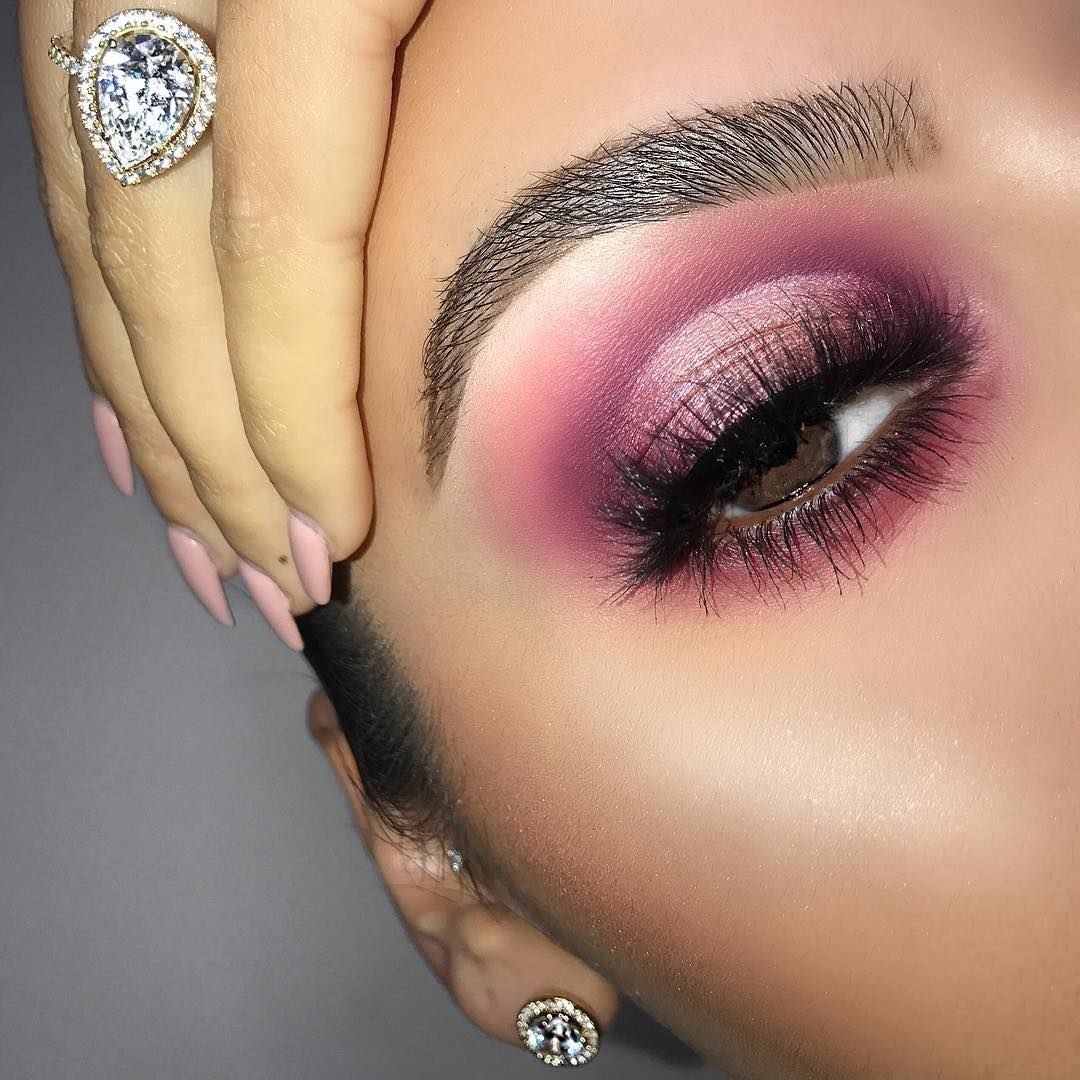
A smokey eye lives on depth, and the photo shows the pink family supplying it: berry and plum shades smoked around the eye, a metallic pink centre that catches light, and lashes kept dark and full. It is moody without turning heavy.
A burgundy red smokey goes deeper and warmer. It suits evening light and brown eyes beautifully, but it can tip into bruised looking territory if the blend strays too far under the eye. The berry pink version keeps a cool softness at the edges, so it reads romantic even at full strength.
Verdict: berry pink smokey for depth that stays soft. Burgundy red when you want the heat turned all the way up.
Build depth in the crease and outer corner first
Keep a lighter metallic shade at the centre of the lid
Dragging dark shades too far under the eye
Skipping the blend at the outer edge
8. Muted Pink vs Muted Red For The Office
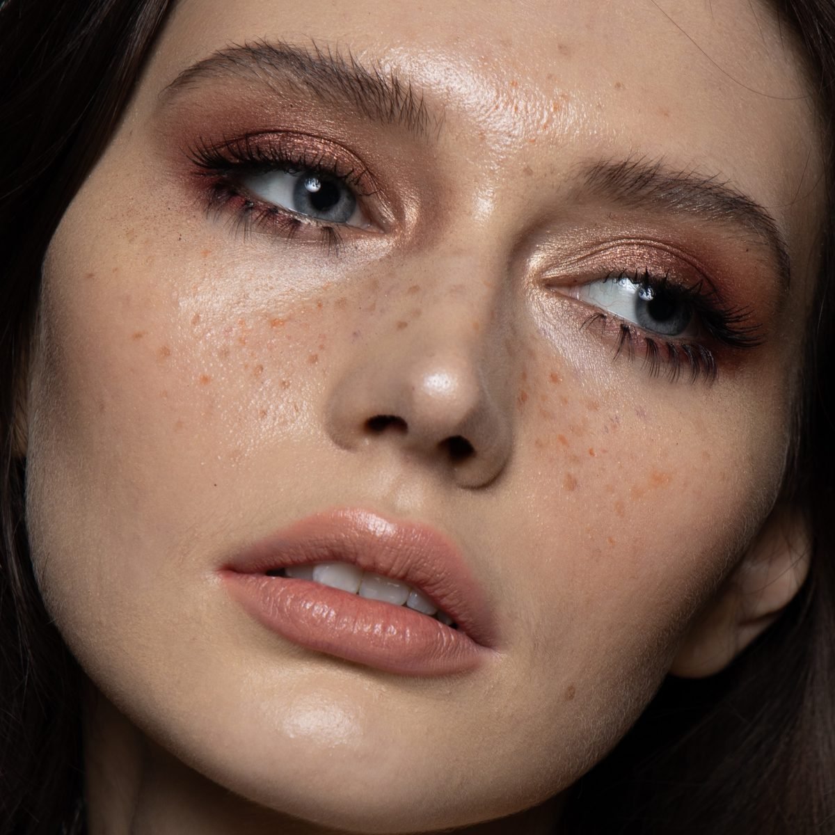
Red can behave at the office, as long as it arrives muted. The photo shows the trick: a copper rust wash with a soft metallic sheen, blended edges, bare looking skin, and a plain nude lip. It reads as warm eye makeup, not as a statement.
Muted pink is the safer desk colour and the easier one to apply half asleep. Dusty rose and mauve pink need no explaining in a meeting room. Muted red, kept to rust, brick, and terracotta shades, gives warm skin tones a polished depth that pink sometimes lacks.
Rules that keep red office safe: one shade only, edges fully blended, nothing glossy competing on the rest of the face.
Verdict: muted pink for ease, muted red for warmth, both welcome at work in their softest forms.
Pick one muted shade: rust, brick, or terracotta
Wash it over the lid and blend the edges until they disappear
Keep lips nude and blush low so the eyes carry the only colour
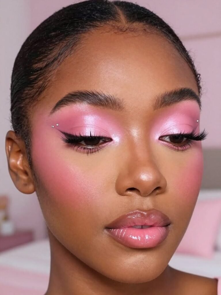
9. Pink In Photos vs Red In Photos
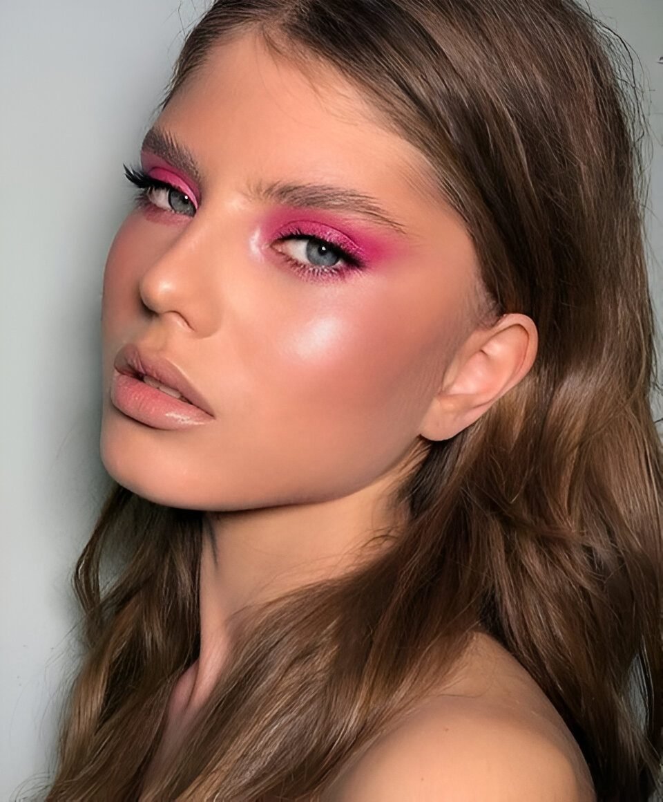
Cameras flatten colour, and the photo shows pink compensating the smart way: saturated hot pink blended around the eyes, skin left glowing, and a plain glossy lip. On camera, that strength reads as fresh and intentional instead of overdone.
Red photographs with even more punch, and it holds up beautifully in evening shots and flash photos. Its risk is different: strong red around the eyes can pick up every trace of tiredness and make the whites of the eyes look less bright in close ups.
One rule serves both sides: go one shade deeper than you would for the mirror, because lenses and lights eat colour.
Verdict: red wins on raw camera impact, pink wins on looking rested in the frame.
10. Pink With Light Eyes vs Red With Brown Eyes
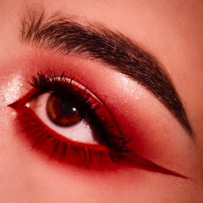
Eye colour changes the maths. The photo pairs red shadow and a red lower lash line with a deep brown eye, and the warmth on warmth works: the iris looks richer, almost amber, against the red frame around it.
Pink flatters light eyes in the same framing way. Rose and mauve shades sit gently beside blue and green irises, making them look clearer and brighter. On brown eyes, gentle pink can read a little flat unless it leans berry or fuchsia, which brings back the contrast.
Verdict: match the family to the iris. Pink first for light eyes, red first for brown ones.
- ▸Blue eyes: rose pink and mauve make the blue look clearer
- ▸Green eyes: berry pink deepens the green without a fight
- ▸Brown eyes: red and burgundy pull out the warm amber tones
11. Spring Pink vs Winter Red Through The Seasons
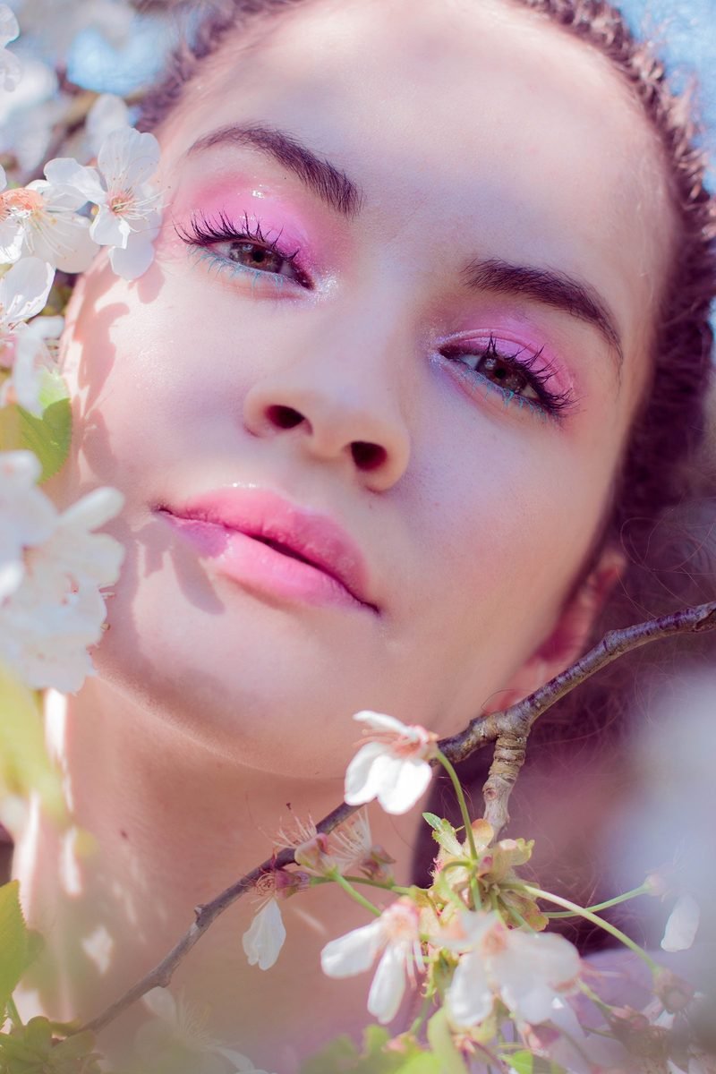
Some colours belong to a season, and the photo makes the case for spring pink without saying a word: glossy pink lids, a soft pink lip, and white blossom framing the face. Pink feels like new growth, fresh skin, and lighter clothes.
Red owns the colder months in the same natural way. Deep red and burgundy shadow match winter coats, darker evenings, and party season dressing, and they warm up skin that winter light has washed out. A bright spring pink in December can look lost, just as a heavy winter red can feel like too much in May.
Verdict: pink blooms in spring and summer. Red earns its keep from autumn through winter.
Glossy pink lids, sheer finishes, fresh skin, colour that matches blossom and daylight.
Deep red and burgundy shadow, matte finishes, warmth that stands up to coats and dark evenings.
12. Forgiving Pink vs Demanding Red For Beginners
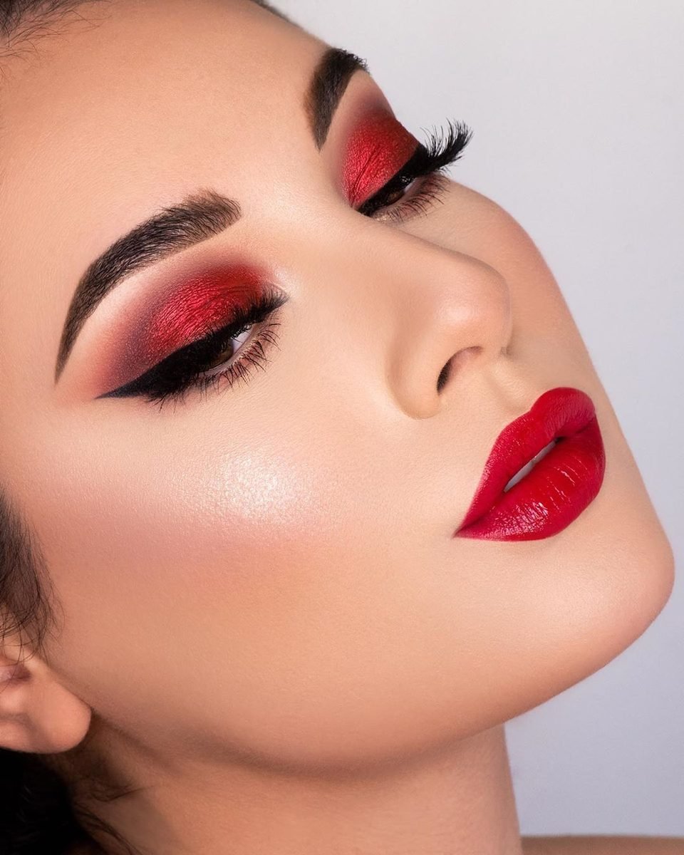
Nobody learns makeup on a look like the one in the photo. Metallic red shadow with a knife sharp wing and a glossy red lip to match is stunning, and it is also the result of practice, patience, and a steady hand.
That is the honest beginner problem with red: it shows everything. Uneven edges, patchy blending, and fallout all announce themselves, because red sits so far from natural skin tones. Pink forgives. A soft pink wash hides a wobbly blend, melts into blush when it strays, and still looks fine on a first try.
Start with pink while your brushes learn the shapes. Move to red once your wing behaves.
Verdict: beginners, pink first. Red is a reward for practice, not a starting point.
⚠️ Watch Out
Red fallout lands pink on your cheeks and stays there. Do your eyes first, clean up with a wipe, then start on foundation.
13. Pink Liner vs Red Liner Accents
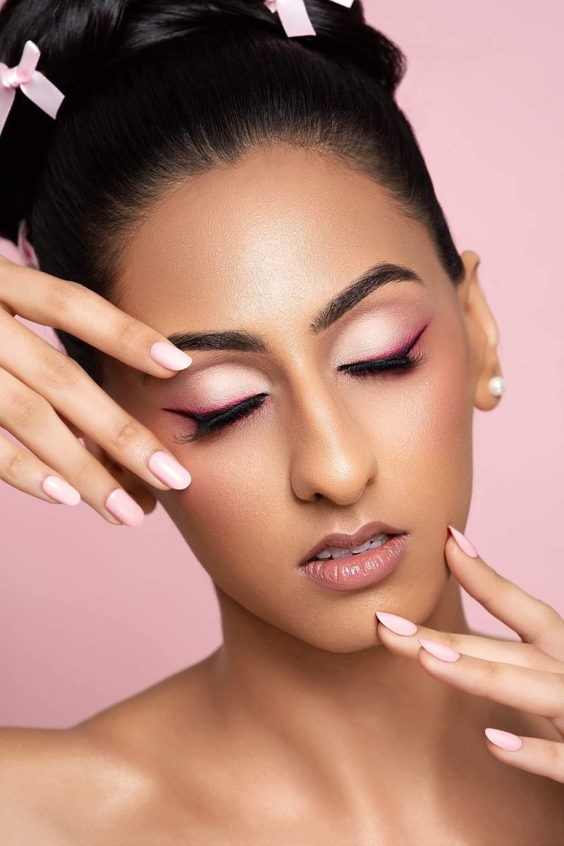
Liner is where both colours get playful. In the photo, a pink line wings out over a pale shimmer lid, sharp against the lashes and soft everywhere else. It gives the eye a graphic edge while the rest of the face stays calm.
Red liner is the bolder accent. A thin red wing or a red lower lash line looks striking and fashion forward, but placement matters: red sitting too close to the eye can make it look sore rather than styled. Pink liner carries far less of that risk, even in bright shades.
Verdict: pink liner for an accent you can wear anywhere. Red liner when the whole look is built around it.
14. Pink On Warm Skin vs Red On Cool Skin
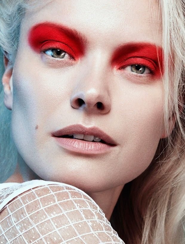
Undertone is where clashes are born. The photo shows a blue based true red swept high on very pale, cool skin, and the pairing looks clean and deliberate: the cool base of the red matches the cool base of the skin, so nothing fights.
Pink on warm skin follows the same logic in reverse. Peachy and coral pinks melt into golden skin tones, while an icy blue pink can sit on top of warm skin looking separate and chalky. The clash rule is simple: match the base of the colour to the base of your skin. Do that one thing, and both colours behave well on almost any face.
Verdict: neither colour clashes on its own. A mismatched base does.
| Warm skin | Cool skin |
|---|---|
| Pink pick: peachy pink, coral pink | Pink pick: berry pink, icy rose |
| Red pick: rust, brick, terracotta red | Red pick: blue red, wine, burgundy |
| Clash risk: icy blue pink looks chalky | Clash risk: orange red looks harsh |
15. The Final Verdict, When Pink Wins And When Red Wins
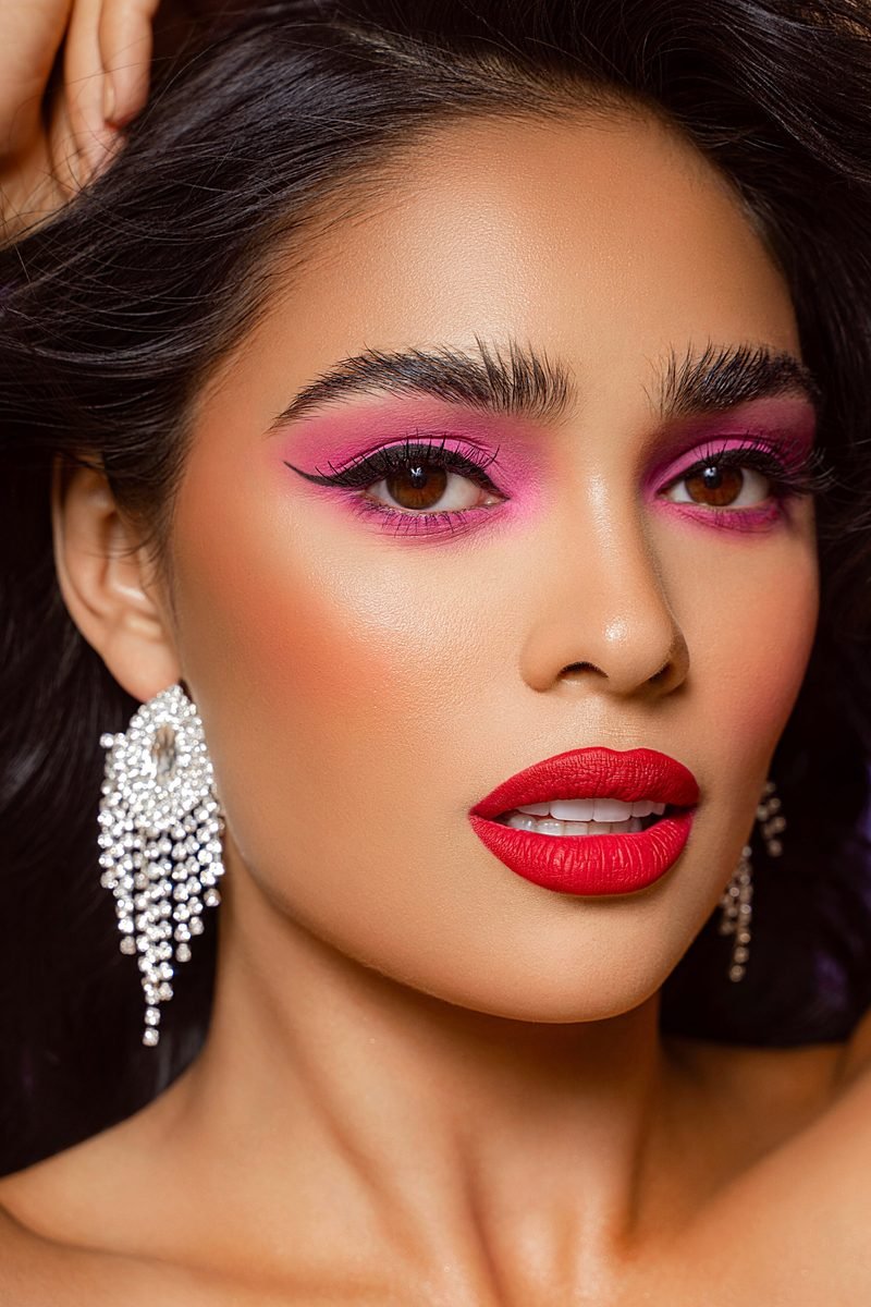
The photo settles the argument better than any scorecard: pink shadow winged around the eyes, a true red matte lip below, both on one face, neither apologising. Pink and red were never really enemies. They are neighbours, and each does a job the other cannot.
Pink wins the everyday points: softness, fair skin, beginners, spring mornings, and any day you want colour that behaves. Red wins the impact points: deep skin, party light, winter evenings, brown eyes, and outfits that need one strong note.
So the real answer is a small wardrobe, not a single winner. Keep a soft pink for the week and a true red for the moments that ask for more, and let your skin, your eyes, and your plans make the call each morning.
Pink for the week, red for the moment. Own both, and let the day decide which one leaves the drawer.
So, pink eye makeup vs red eye makeup has no single winner, and that is the good news. Pink wins on softness, on fair skin, on busy mornings, and on any day you want colour without a fight. Red wins on impact, on deep skin, on party lights, and on the days a plain outfit needs one strong point. Keep a soft pink for the week and a true red for the moments that ask for more, and let your skin tone and your plans make the final call. Save this guide for the next time you stand at the mirror, palette in hand, still deciding.