18 Pink Eye Makeup Mistakes To Avoid That Actually Work
Pink eyeshadow has a reputation problem. One small slip and it stops looking pretty and starts looking like a late night, an allergy, or a crying session. The colour itself is rarely the culprit. Most failed pink looks trace back to the same handful of habits, like pink sitting in the waterline, glitter with nothing to grip, or a crease blended halfway to the brow. This list walks through 18 pink eye makeup mistakes to avoid, and every entry shows the corrected version in a real photo, so you can see exactly where the colour should sit and how the fix changes the result. Some fixes take ten seconds, like wiping the waterline clean. Others are about choosing the right pink family for your skin before a brush touches your face. Work through the ones you recognise from your own mirror first. Pink is one of the most forgiving colours to wear once the placement is right, and these photos prove how small the changes need to be.
1. Mistake 1: Pink Placed Too Close To The Waterline
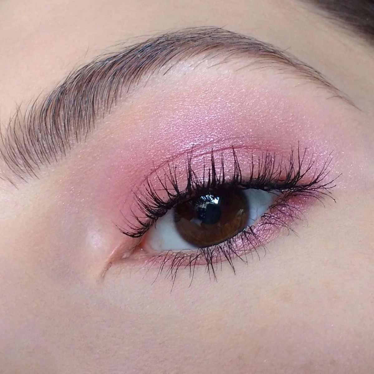
Pink shadow has one placement trap that ruins it faster than any other. The colour drifts into the waterline, the thin inner rim of the lower lid, and suddenly a pretty look reads as sore, tired eyes. Pink sits close to the natural redness of that rim, so the two blend into one irritated wash. The photo shows the fix clearly. Every bit of colour stays on the lid and in the crease, with a deeper pink strengthening the outer corner. A soft touch of pink sits below the lower lashes, on skin, where it belongs. The waterline itself stays bare, and the white of the eye looks bright against the pink. Keep a cotton bud nearby while you apply, and wipe the rim clean at the end.
Keep pink on the lid, in the crease, and softly below the lashes.
Leave the waterline rim bare so the eye white stays bright.
Running pink shadow or liner along the waterline itself.
Letting fallout settle on the rim while you blend.
2. Mistake 2: Skipping Primer So Pink Turns Patchy
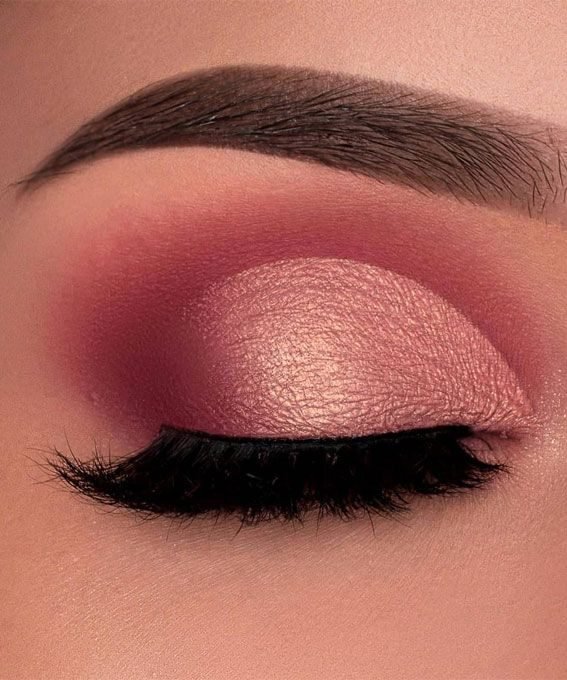
Bare skin and pink pigment do not get along. On an unprimed lid, natural oils break the colour up within an hour, leaving strong patches at the crease and bald spots where the lid folds. The result looks uneven no matter how carefully you blended at the mirror. Look at the closed eye in this photo. The metallic rose sits in one smooth sheet from lash line to crease, and the deeper pink behind it is just as even. That kind of finish starts before any colour goes on. A thin layer of eye primer, or a matte concealer set with translucent powder, gives the pigment something to hold. Pat the pink on with a flat brush instead of sweeping, and the coverage stays dense and level.
Smooth a thin layer of primer or matte concealer over the whole lid.
Set it with a whisper of translucent powder so the surface feels dry.
Pat the pink on with a flat brush, then blend the edges only.
3. Mistake 3: One Flat Pink With No Depth Shade
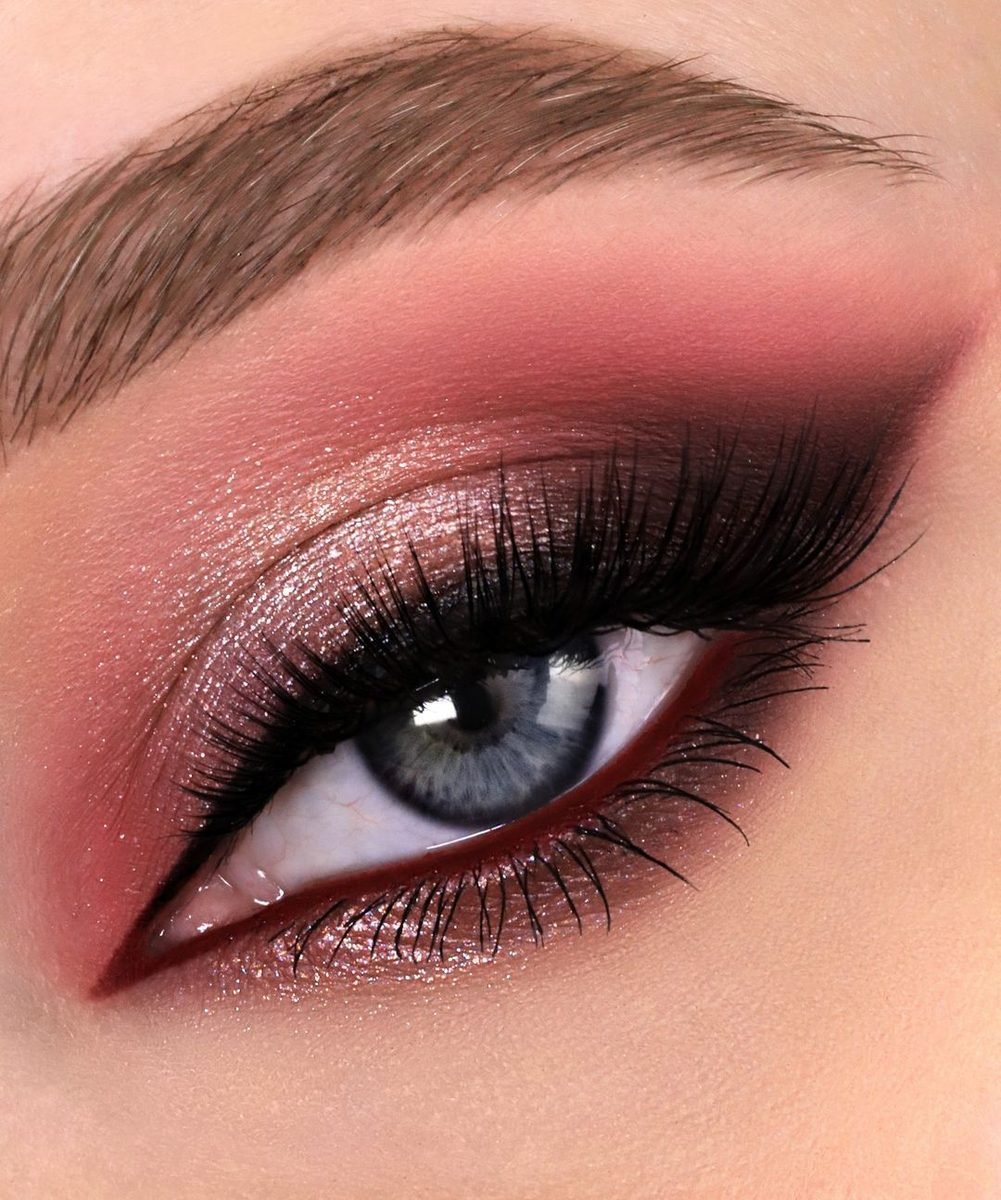
One flat pink from lash line to brow is the fastest route to a look that feels unfinished. Without a deeper shade, the eye loses its shape, and the pink floats on the face instead of framing the eye. This photo builds the same colour family in three strengths. A rose shimmer covers the lid, then a deep burgundy pink is packed into the crease and pulled around the outer corner. That dark frame does three jobs at once:
- It gives the crease a shadow, so the eye keeps its natural depth.
- It anchors the shimmer, which stops the lighter pink looking washed out.
- It shapes the outer corner, so the look has a clear end point instead of fading away.
4. Mistake 4: Pink Crease Blended Too High
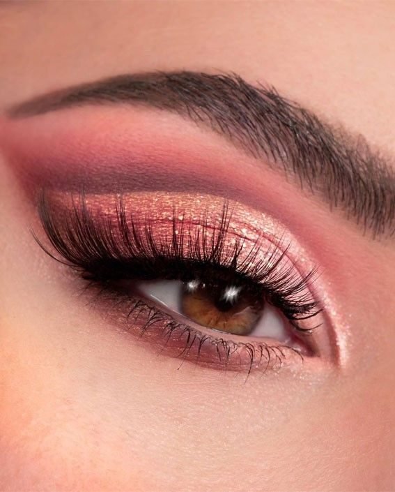
Enthusiasm with the blending brush causes this one. Each extra sweep drags the crease colour a little higher, until the pink reaches the brow and the whole eye area turns into one pink block. The eye looks smaller, and the look reads heavy. In this photo the deep rose band stops where the socket ends. Above it, the skin fades back to bare and the brow bone stays clean, which is exactly what makes the rose gold lid underneath look so rich. Work with a smaller brush than you think you need, keep your eyes open while you place the crease shade, and check the height in a hand mirror held at arm’s length. If the colour shows just above the fold when your eye is open and relaxed, it is sitting in the right zone.
💡 Quick Tip
Place crease colour with your eyes open, looking straight ahead. The shade belongs in the socket line you can see, not the one you feel with the brush.
5. Mistake 5: Blush Matched Too Strongly To The Pink
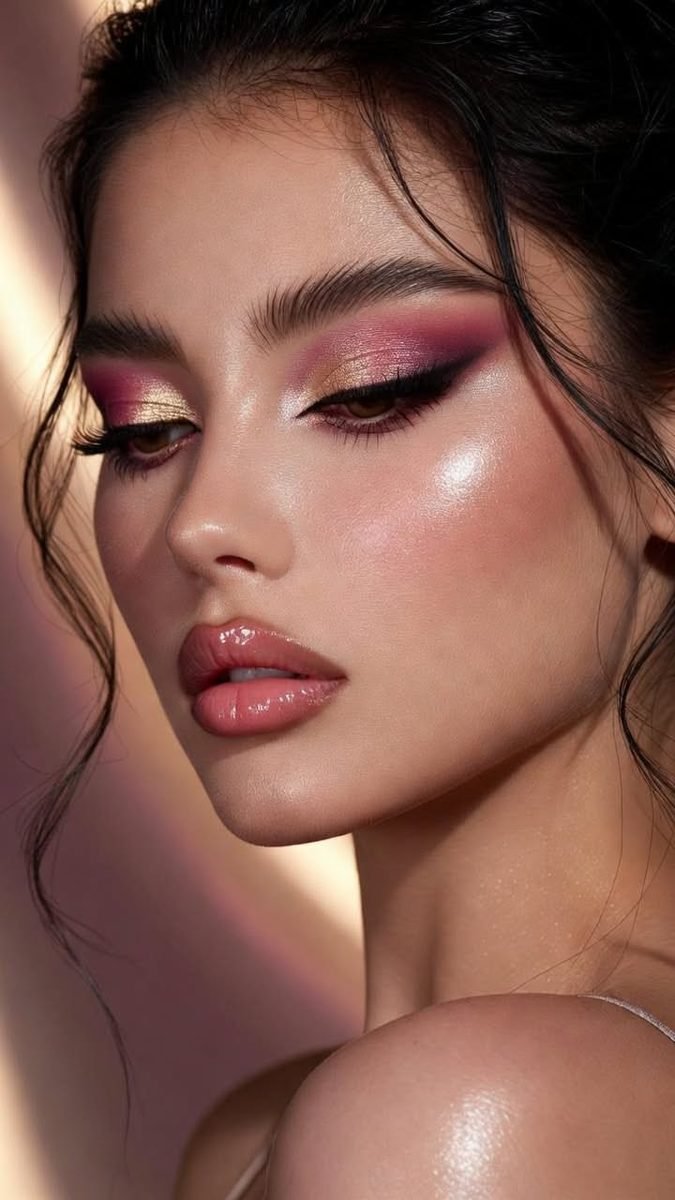
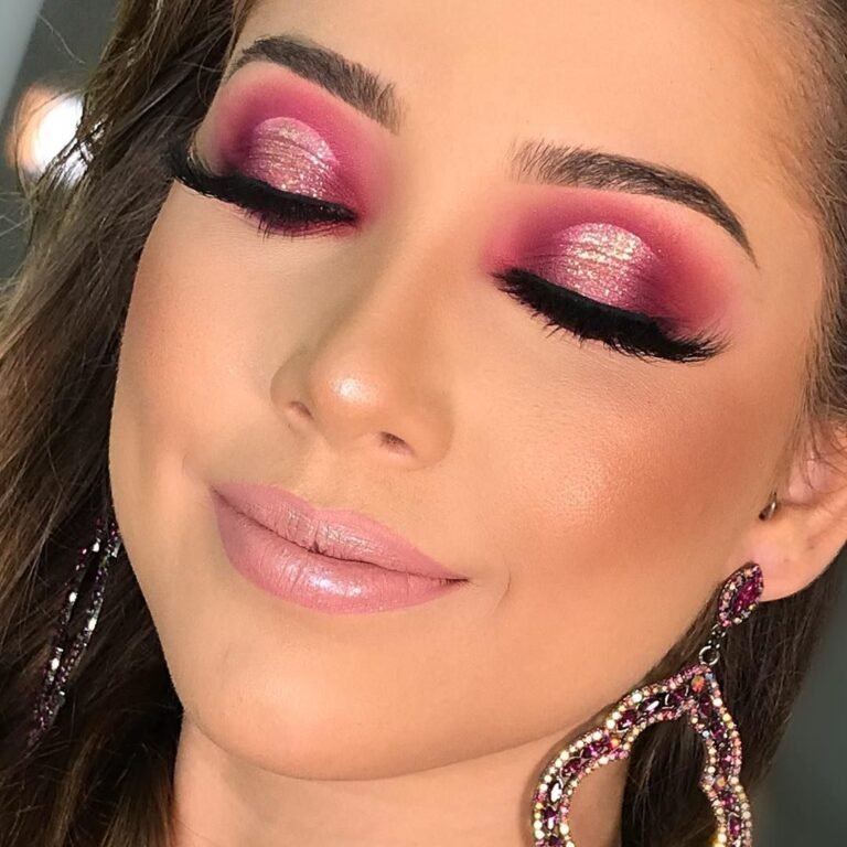
Matching blush to pink shadow sounds tidy, and on the face it often turns into too much of one note. Strong pink cheeks next to pink eyes can make the whole face look flushed, even feverish on fair skin. The balance in this photo is smarter. The eyes carry the full pink story, magenta shadow with gold at the centre and a deep, winged outer corner. The cheeks wear a soft warm wash of blush instead, muted and glowy rather than pink. Because the blush stays quiet, it supports the eyes without competing with them. Your blush and shadow can share a family without sharing a shade. If the eyes are cool pink, warm the cheeks slightly. If the eyes are coral, keep the blush dusty and light.
Pink eyes with strong pink blush in the same shade. The face reads flushed, and the two pinks fight for attention.
Pink eyes with a soft, muted wash of blush, like this photo. The eyes stay the main event and the cheeks add warmth.
6. Mistake 6: Glitter With Nothing Under It To Grip
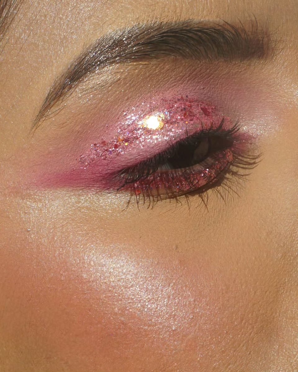
Loose glitter pressed onto bare skin has nothing to hold it. Within an hour it migrates, lands on the cheeks, and the lid looks patchy where it slid away. The dense, even sparkle in this photo starts with a base layer. Before glitter like this goes on, the lid needs a cream shadow or glitter primer spread thin, then a layer of pink shimmer packed underneath, so any tiny gaps still show colour. The glitter itself gets pressed on with a flat brush or a fingertip, never swept, because sweeping scatters it across the face. Work in small sections and keep looking down until the layer sets. Fallen specks lift away cleanly with a piece of tape pressed lightly on the skin.
7. Mistake 7: Harsh Lines Left Unblended
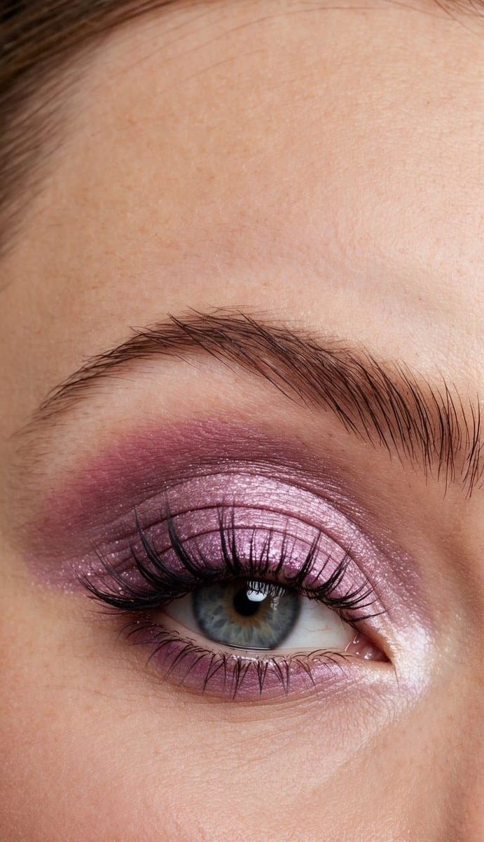
A hard edge is easy to spot once you know to look for it. The pink stops in a visible line at the crease or the outer corner, and the look feels stamped on instead of blended in. Pink shows edges more than brown does, because the colour contrast against skin is higher. Nothing in this photo stops suddenly. The mauve pink melts from the lid into the crease and fades at every border, so you cannot point to where the colour ends. That finish comes from a clean, fluffy brush used after the colour is placed, with almost no product on it. Blend in small circles right on the edge line only. Blending the whole lid again just moves colour around and muddies the deeper shades you placed on purpose.
8. Mistake 8: Pink Too Cool For Warm Skin

Blue based pinks, the ones with a lilac or fuchsia lean, can turn ashy and grey on warm or golden skin. The colour is not wrong in the pan. It is simply fighting the warmth underneath it, and the skin wins. This profile shows the warmer route. Coral pink melts across the lid with gold shimmer at the centre, and every tone agrees with the warm skin and the peachy blush below it. The pink reads fresh instead of chalky. A quick test before you commit: hold the shadow next to your inner wrist in daylight. If your skin looks grey beside it, reach for the coral, salmon or warm rose version of the same idea.
| Cool Pink | Warm Pink | |
|---|---|---|
| Undertone | Blue, lilac, fuchsia lean | Coral, salmon, golden rose lean |
| On warm skin | Can sit grey and ashy | Reads fresh and glowing |
9. Mistake 9: Skipping Liner So Eyes Look Tired
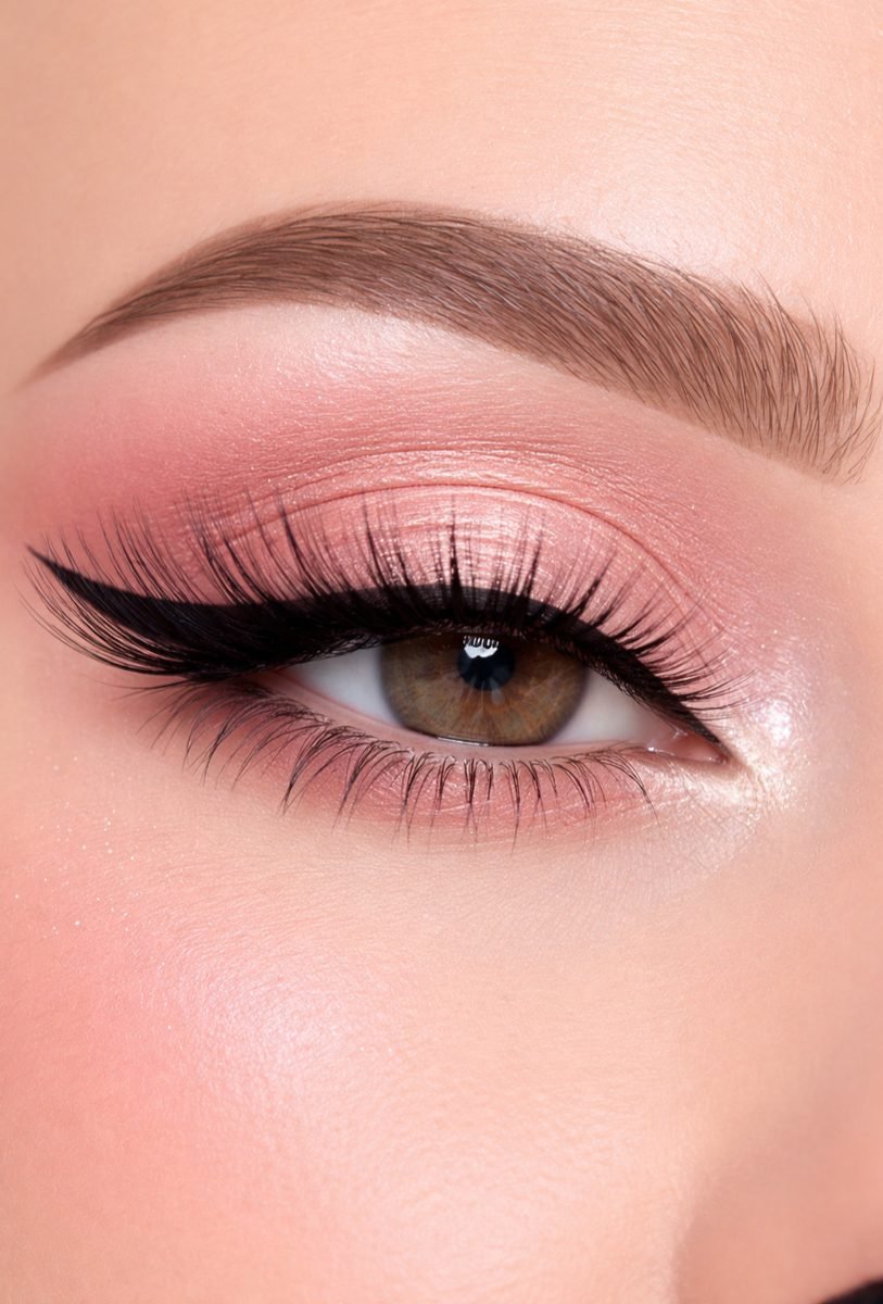
Pink without any definition can leave eyes looking puffy and tired, especially pale pink, which sits close to skin tone and blurs the lash line away. The shadow is pretty, but the eye itself disappears. The neat black line in this photo changes that. It runs close along the upper lashes, fine at the inner corner and lifting into a slim wing at the outer edge. That one line gives the soft rose something to lean against, and the eye looks awake again. You do not need a dramatic wing to get the effect. A thin line, or even dark shadow pressed into the lash roots with a small angled brush, is enough to separate lashes from lid.
10. Mistake 10: Heavy Pink Packed On The Lower Lash Line
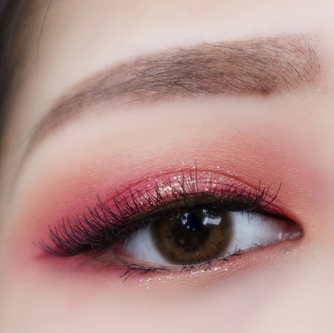
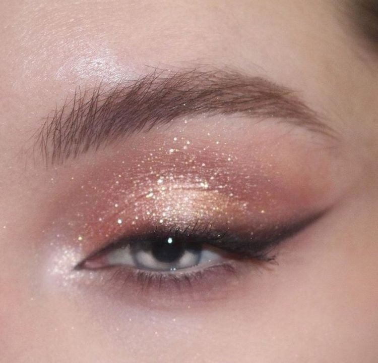
The lower lash line needs a lighter hand than the lid. Packing strong pink underneath the eye drags the whole look downward and copies the look of a sleepless night, because that is exactly where tiredness shows. In this photo the coral glitter stays up top where it belongs. Along the lower lashes there is only a fine sparkle of pale pink, enough to connect the look, not enough to weigh it down. Use the smallest brush you own for this area, pick up a little product, and tap most of it off before you touch the skin. Run the colour along the outer half of the lower lashes only. Keeping the inner half bare holds the eye bright and open.
⚠️ Watch Out
If the pink under your eye is as strong as the pink on your lid, it is too much. Under eye colour should read as a whisper of the lid shade.
11. Mistake 11: Shimmer Everywhere On Textured Lids
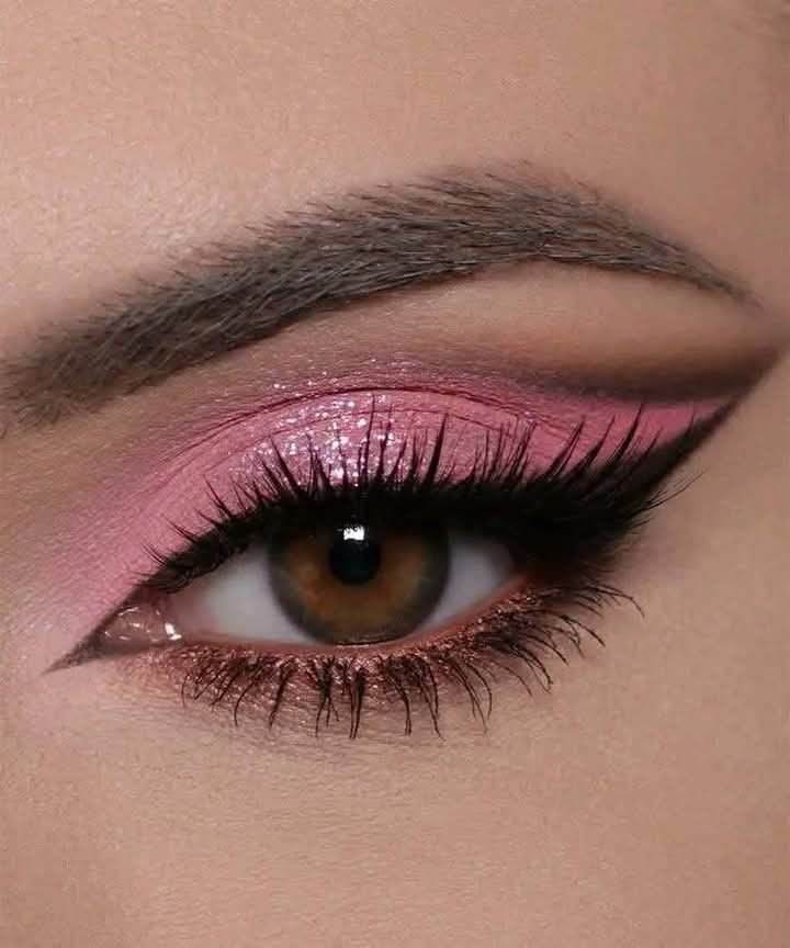
Shimmer reflects light from every angle, and on a textured or creased lid that sparkle settles into every fine line and points straight at it. A full shimmer lid can end up showing more texture than colour. The placement in this photo is far kinder. Matte pink covers the inner and outer parts of the lid, a matte brown defines the crease, and the shimmer is kept to one stripe at the centre of the lid. The eye still catches the light, but the shine sits on the smoothest part of the lid where it flatters. If your lids are textured, keep shimmer small and central, and let matte shades do the shaping work around it.
Matte shades for the crease, inner and outer lid.
One small stripe of shimmer at the lid centre only.
Shimmer across the whole lid on textured skin.
Frosty shades in the crease, where lines sit deepest.
12. Mistake 12: Pink And Red Tones Clashing In One Look
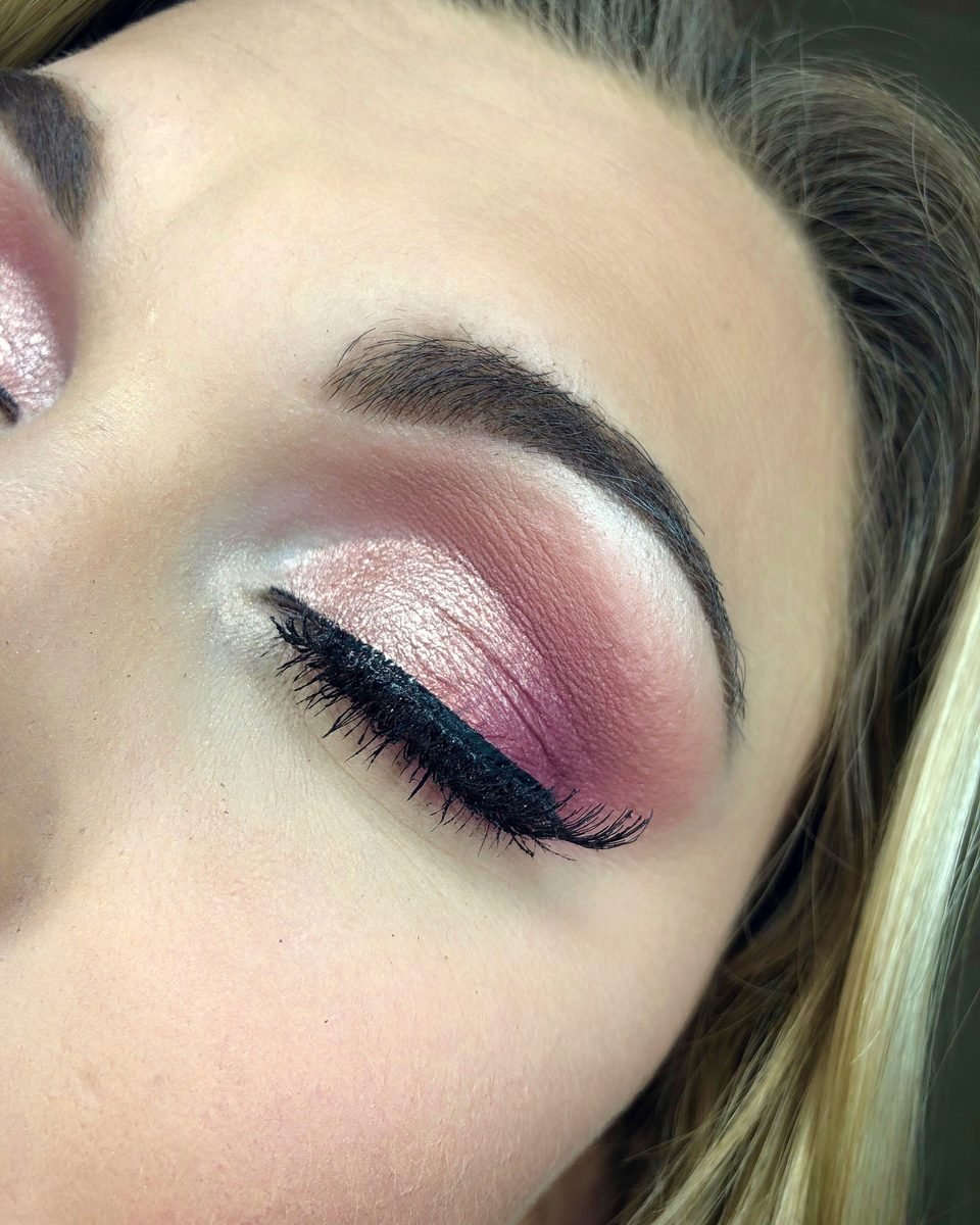
Pink and red feel like neighbours, so they get mixed into one look all the time. A warm red crease over a cool pink lid, or an orange leaning shadow beside a fuchsia liner, and the tones start arguing with each other. Every shade in this photo belongs to one family. The lightest pink sits at the inner corner, a bright shimmering pink covers the lid, and the deepest shade in the crease is simply a stronger version of the same pink. Because the family holds together, nothing clashes. When you dig through your palettes, line your chosen shades up together in daylight before you start. If one suddenly looks orange or brick red next to the others, leave it out of the look.
- One undertone: every pink in the look leans the same way, cool or warm.
- Depth by strength: the crease shade is a deeper version of the lid shade.
- Daylight check: shades lined up together before the first brush stroke.
13. Mistake 13: Forgetting The Inner Corner Balance
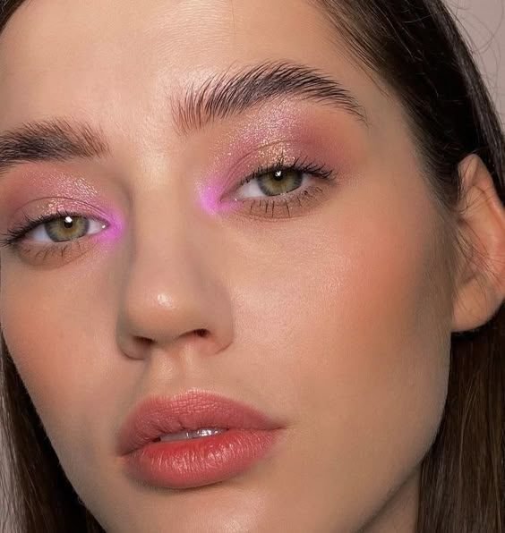
The inner corner is a small area with an outsized job. Skip it, and a pink look can feel unfinished at the front of the eye, heavy at the back where the deeper shades sit. The bright pink point placed at the inner corner of this look balances the deeper mauve shades behind it. That bright point pulls light to the front of the eye, opens the space between the eyes, and gives the pink a clean starting point. Use the lightest, brightest shade you own, a pale shimmer or a vivid pink like the one here, on a small pencil brush. Keep it tight to the corner and the first third of the lower lash line. A tiny area is all it takes.
14. Mistake 14: Mascara Skipped So Pink Washes Out The Lashes
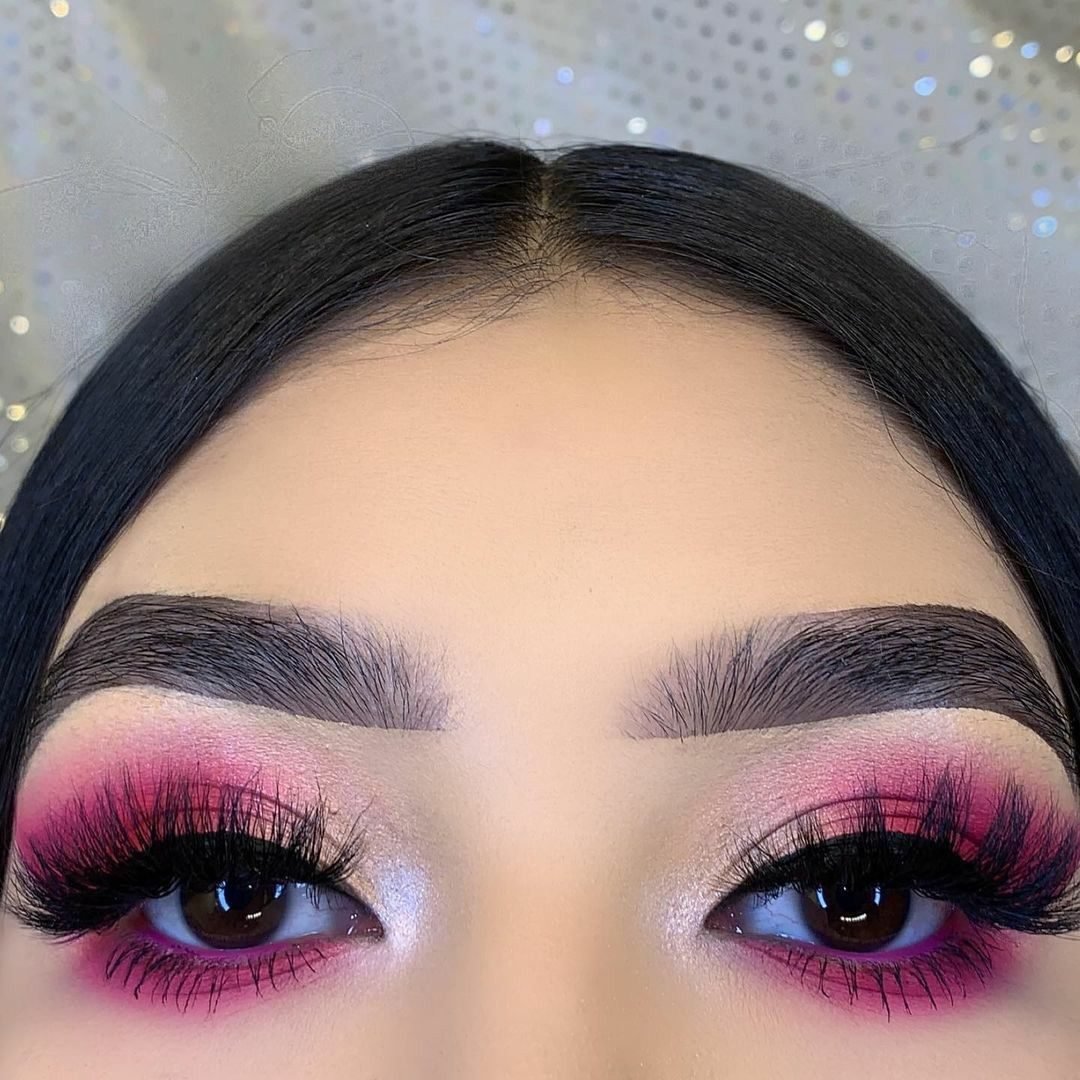
Pale lashes against pink shadow are a quiet problem. Fair lashes almost disappear into the colour, and without that dark frame the eye looks washed out, however good the blending is. Both eyes in this photo are ringed with fully coated black lashes, top and bottom, and the pink reads richer because of it. Build the frame in a simple order. Curl first, so the lashes lift away from the pink. Coat the top lashes from root to tip, working the wand side to side as you go. Then catch the lower lashes with the tip of the wand held upright. One coat is rarely enough against strong pink. Two thin coats beat one thick one, which clumps and flakes onto the shadow you just finished.
Curl the lashes so they lift clear of the pink.
Coat the top lashes root to tip, then repeat with a second thin coat.
Catch the lower lashes with the wand tip held upright.
15. Mistake 15: No Transition Shade Near The Brow Bone
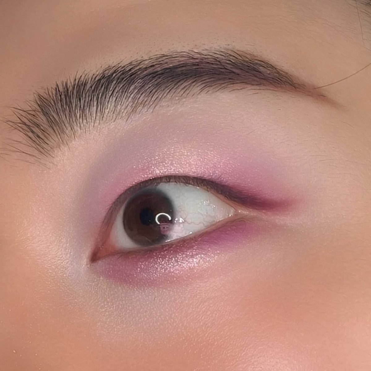
Without a transition shade, pink stops like a cliff edge. The deep colour ends, bare skin begins, and the gap between them shows every brush stroke. A transition shade is the in between colour that carries one into the other. In this photo a pale milky pink sits between the mauve outer corner and the brow, and the colour steps down so gently that there is no line to find. Pick a shade one step lighter and softer than your main pink, matte, and sweep it just above the crease before the deeper shades go on. It takes thirty seconds, and every colour you add afterwards blends into it instead of stopping dead against the skin.
Deep pink placed straight onto bare skin. The colour stops in a hard line and every brush stroke shows.
A pale milky transition shade swept above the crease first. The pink steps down gently, like the fade in this photo.
16. Mistake 16: Neon Pink At Full Strength For Daytime
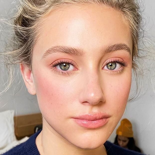
Neon pink is honest colour. It does not pretend to be subtle, and at full strength on a Tuesday morning it can wear you instead of the other way round. The same idea at half strength is a different story. The rosy pink on the eyes in this photo is muted, blended and close to the model’s own colouring, so it reads as fresh rather than loud. Sheer the colour out to get there. Apply with a fluffy brush instead of packing it on, choose a dusty or muted version of the shade, and stop one layer earlier than feels finished. In daylight, that restraint is exactly what makes pink look polished and easy to wear.
17. Mistake 17: Copying A Look Without Adjusting For Eye Shape
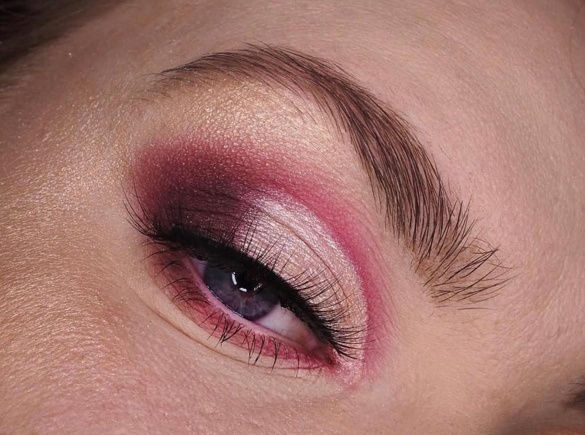
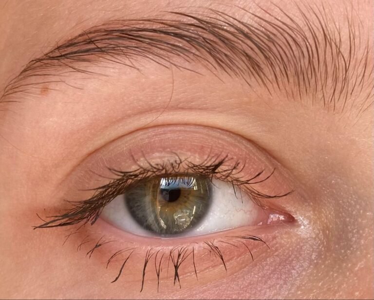
Copying a look brush stroke for brush stroke ignores the one thing that changes everything, the shape of your own eye. A crease shade placed in a natural crease vanishes on a hooded eye the moment it opens. Look closely at this eye and you can see the adjustment. The pink crease line is drawn above where the natural crease falls, on the part of the lid that stays visible, with a pale shimmer lid below it. Placed there, the colour survives opening the eye. Before you copy any look, find where your own crease sits and where your lid actually shows. Move the colour to the visible skin, and the same shades will finally do what the photo promised.
18. Mistake 18: Giving Up On Pink After One Bad Try
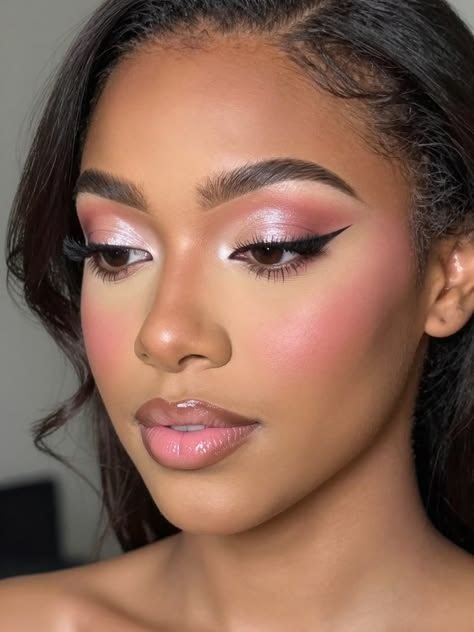
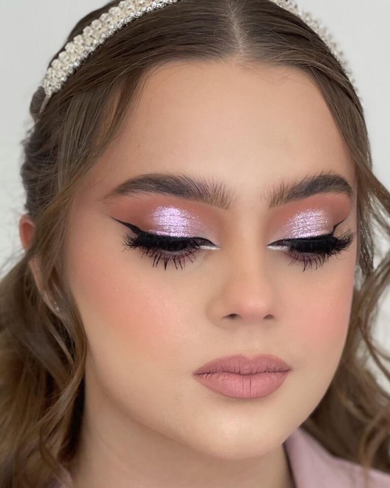
One patchy try convinces a lot of people that pink is not for them. Usually the colour was never the problem. The primer was skipped, or the shade fought their skin tone, or the lashes never got their dark frame. Every fix in this list is small, and together they add up to a look like this one. Pink shimmer sits smoothly on the lids, a slim wing defines the shape, lashes are coated, and the whole face looks polished and calm. Give pink a second try with two or three of these fixes in place before you judge it. Start with the mistake you recognise most from your own mirror. That single change is often the one that turns the whole look around.
💡 Quick Tip
Change one habit at a time and wear the look for a full day before judging it. Pink that survives real light and real hours is pink that works.
None of these fixes ask for new products or advanced skills. They ask for placement, a lighter hand in the right spots, and shades that agree with your skin. Pick the two or three pink eye makeup mistakes to avoid that sound most like your own routine, and change those first. Small corrections stack up fast with pink, because the colour itself was never working against you. Save this list for the next time you reach for a pink palette, and check your mirror against the photos before you blend. Your next pink look can be the one that finally behaves.